
I've always found the process of breaking down visualizations incredibly energizing. How do you encode information into the most basic components so the user just gets it?
That was the main goal for our team in the 2017 Datafest competition. We had a dataset that had a gigabytes of historical Expedia data. Our challenge? "Make something useful." Talk about ambiguity! Here's what we came up with.
 Our first insight was around impromptu summer trips. Upon examining the trends by month, we noticed that there was a larger number of clicks and bookings in June and July, yet a shorter days before check-in. As they were keeping their prices consistent across months, they were missing out on a key component of price elasticity.
 Most of their geography targeting as presented to us was done at the state level. However, there is a wide variety of variation at the census tract level and state level that portrayed the wide variety of personas. For example, people in New York had 0.15 children per booking, while people in NYC had 1.6 children per booking. Leveraging the census tract data that is publicly available, they could begin to tailor more targeted pricing and options to their users.
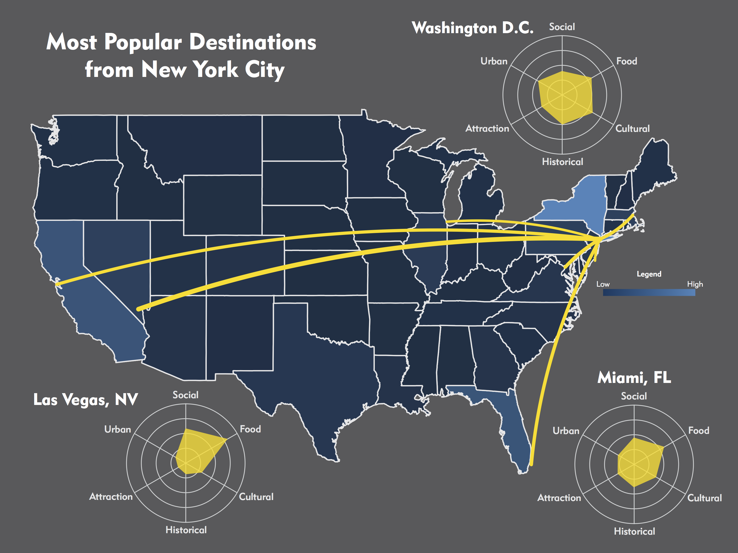 Lastly, we showed how bringing in third-party city aggregate data could add value when booking a trip. Instead of having a destination in mind, Expedia could leverage existing knowledge about the dynamics of a city to help the traveler decide which trip is best for them and recommend similar destinations.
This presentation won best visualizations for the Datafest competition.